An example of how I create quick tones for my comics.
***Use textures that you have been given the rights to use. I use textures created by Hibbary at https://www.deviantart.com/hibbary/gallery/1589588/resources (you can also find her Patreon here: https://www.patreon.com/hibbary). You can see in the her texture descriptions that she allows commercial uses of her textures, which is what you want if you ever plan to make money off your comics. Don’t assume if someone offers their resources for hobby use that they also allow commercial use.
-Start with a happy little greyscale canvas.
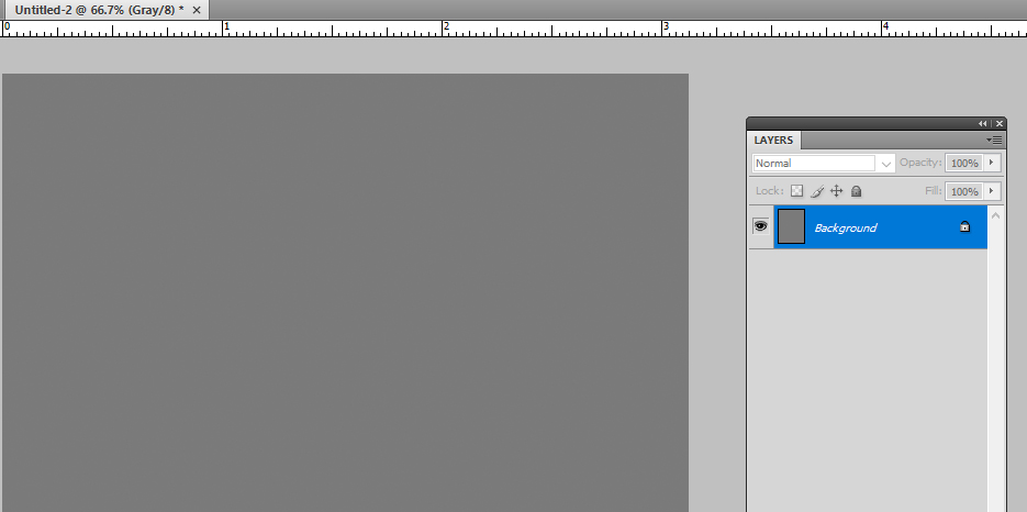
Greyscale is a must. Not RGB or CMYK. In photoshop, when you create a new image, you find it under color mode.
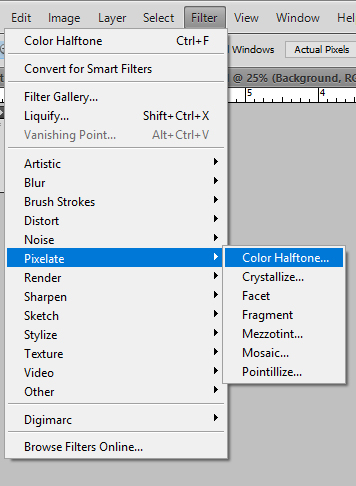
-Next you go to Filter, Pixelate, and Color Halftone. Max radius will depend on what size you’re working at. I work at 300 dpi and I use 6-8 max pixels.
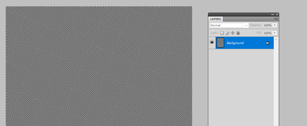
Taadaa, a basic grey screentone.
-Next is the DRAMATIC EFFECT.
Choose something that matches the feel you’re going for. Let’s say we want something dramatic and ominous. Boom, this looks good.
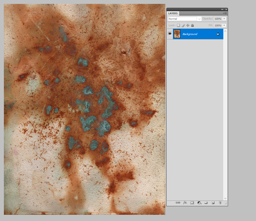
Desaturate or greyscale it or what have you.
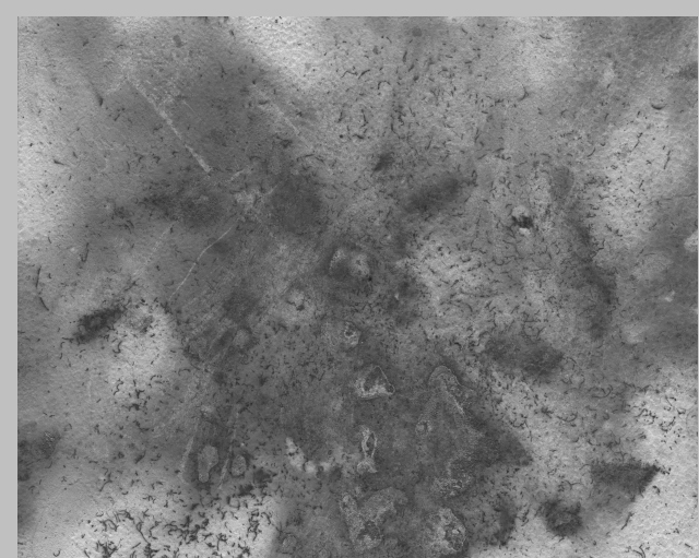
-Now take your basic screentone and put it on top of your happy little grey texture.
-Mess about with the layers. In this example I used screen.
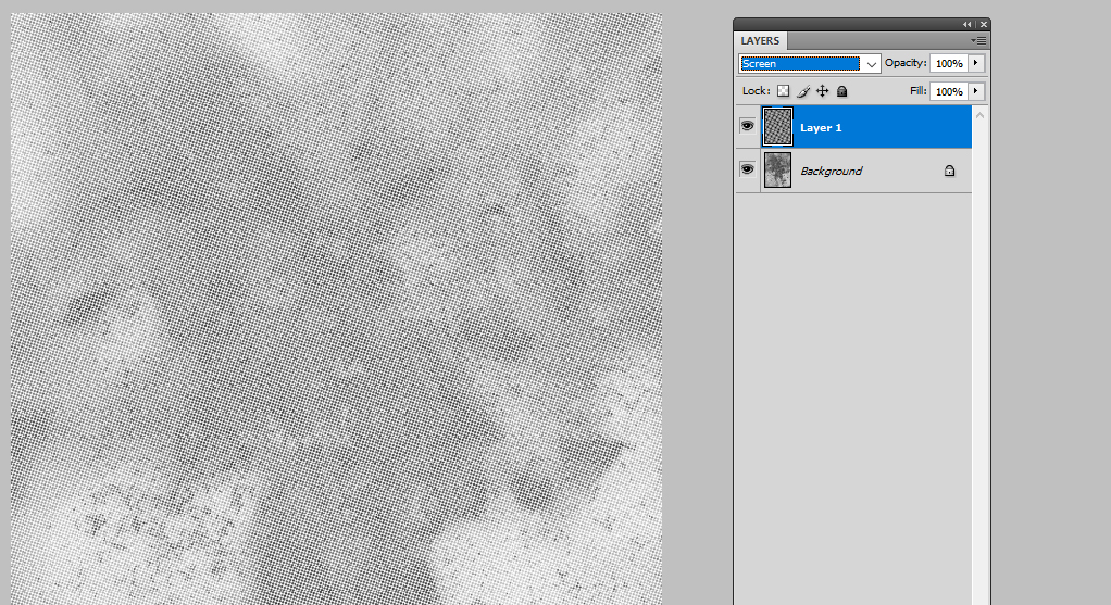
-Mess around with the brightness/contrast of the texture as you please to get the effect you want.
-Merge the layers and you’re done.
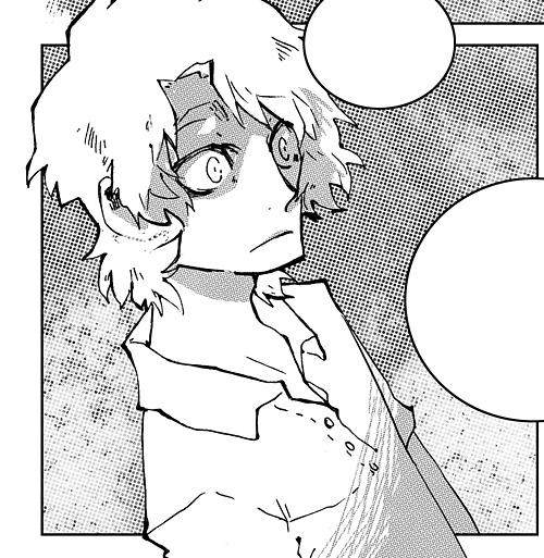
Here’s an example of that same tone we just made in a panel.
I’m sure there are better ways of doing this, but I made up this method from years of just messing around. I’m aggressively ignorant of proper Photoshop use, womp womp.